
Have you ever stopped in front of an ATM and seen something odd? Some are red. Others are blue. You likely tapped your card and got your cash without thinking twice. Here’s the thing—colors aren’t random, especially not in banking. So, why are some ATMs blue instead of red? Is it design appreciation?
Branding? Or is there a deeper reason behind it? Let’s explore the psychology, branding strategy, and customer behavior that explain this curious trend—and you’ll never look at an ATM the same way again.
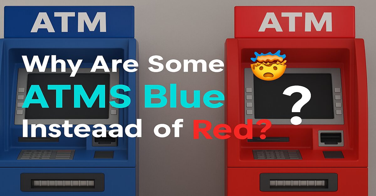
A Modern-Day Color Code
Walk through any city and you’ll see a rainbow of ATM colors. But blue and red dominate. That’s not a coincidence. Banks are intentionally choosing ATM colors—and they’re doing it for you.
At first glimpse, it might seem minor. But in a world where consumer trust and brand identity matter more than ever, color is a powerful, silent communicator.
Color Psychology in Banking
Let’s start with the basics: color psychology. This is the science of how colors influence our emotions, decisions, and perceptions—something marketers and designers rely on daily.
Here’s what the two dominant ATM colors say without using a single word:
Red: Energy, Urgency, Attention
- Red grabs your eye.
- It’s often associated with power, alertness, or action.
- Many fast-food chains, emergency signs, and retail sales use red because it prompts quick decisions.
But there’s a flip side:
- Red can also trigger anxiety, especially around money.
- In financial terms, red often means loss (think “in the red”).
Blue: Trust, Security, Stability
- Blue is calming and builds trust—that’s why so many banks use it in logos.
- It signals safety, stability, and reliability.
- When you’re dealing with money, blue quietly reassures you: “It’s all good.”
So when you ask why some ATMs are blue instead of red, part of the answer is emotional—blue simply feels safer.
Branding Is Everything in Banking
Colors are a core part of a brand’s identity, especially in industries where trust is crucial, like banking.
Here’s how it plays out:
Banks That Use Blue ATMs
- Chase – Clean blue brand, blue ATMs.
- Barclays – Iconic blue across branches and machines.
- Capital One – Often blue-heavy with calm tones.
These brands want you to feel secure, not rushed. They know that trust builds loyalty, especially with your money.
Banks That Use Red ATMs
- HSBC – Known for red branding and strong global presence.
- Santander – Bold red stands out in busy areas.
- Bank of America – Red-heavy branding and signage.
Red grabs attention fast. It can help ATMs stand out quickly in crowded urban areas, which is great for busy customers or tourists.
ATM Colors Can Influence How You Feel About Fees
Studies in marketing show that color can influence perceived cost or risk.
- A red ATM might subconsciously feel more “urgent” or “expensive,” especially if there are unexpected fees.
- A blue ATM might feel “calmer” or “fairer” even if the fee is the same.
While the effect is subtle, customer emotion plays a massive role in whether they’ll return to the same bank’s ATM.
What Your Brain Sees First
Think of the last time you searched for an ATM late at night or while traveling. You probably scanned the area and looked for familiar colors, not logos.
That’s because your brain identifies color before text or symbols.
So, banks use color to:
- Help customers find ATMs faster
- Reinforce their brand subconsciously
- Signal “safe to use” vs “maybe not for me”
When you wonder why some ATMs are blue instead of red, part of the answer is that your brain can spot them before your eyes even read the screen.
Global Differences in ATM Color Usage
In the U.S.:
- Blue is often used to signal reliability.
- Tech-savvy banks and online financial services lean into cooler tones.
🇬🇧 In the U.K.:
- Banks like Barclays and NatWest use blue and purple.
- Red is reserved for brands that want a bold and energetic presence.
🇯🇵 In Japan:
- ATMs are often integrated with convenience stores and use a mix of blue, white, and grey for a tech-focused, clean appearance.
Each country has different cultural responses to color, but the goal is the same: to build trust and recognition.
Location Matters: ATMs Adapt to Their Environment
Sometimes, ATM color isn’t just about branding but also location and function.
- Inside banks: ATMs often match the bank’s official colors.
- In malls or airports, the color may be brighter (red or yellow) to stand out.
- On the street: Blue is calming and blends better into public settings, signaling trust at night.
So, blue ATMs are often placed where reassurance is more important than speed, while red ATMs are more common in high-traffic, fast-paced areas.
Digital Design Influences Physical ATMs Too
Most people don’t realize that the design of mobile banking apps affects how banks design physical machines.
- Apps use blue themes because they look cleaner, more professional, and modern.
- That same aesthetic gets carried over into ATM design, especially for digital-first banks.
If you’re used to seeing blue every time you open your banking app, you’ll naturally trust a blue-colored ATM when you see it on the street.
What Customers Want (Hint: It’s Not Just Color)
Ultimately, people don’t choose an ATM because it’s blue or red. But color plays into overall trust and experience, especially when:
- You’re using an unfamiliar machine
- You’re in a rush
- You’re accessing money late at night
In those moments, subtle psychological cues like color make a big difference.
FAQ – People Also Ask
Q: Why are ATMs different colors?
A: ATM colors often reflect the branding strategy of the bank and are used to trigger emotional responses like trust, urgency, or visibility.
Q: Is there a reason blue is used in banking so much?
A: Yes, blue signals trust, security, and professionalism—all critical values in the financial world.
Q: Does ATM color affect how many people use it?
A: Indirectly, yes. Studies show that color can influence trust and perception, impacting user behavior.
Q: Are red ATMs unsafe?
A: Not at all. Red ATMs reflect different branding goals—often speed, attention, or global consistency.
Final Thought: It’s Just a Color… Or Is It?
Next time you walk down the street and spot an ATM, take a second look. Is it red or blue? Where is it located? What brand is it? How does it make you feel?
In the world of finance, every detail is intentional—and that includes color. So, why are some ATMs blue instead of red? Because color builds trust. It catches your eye. It makes you feel something.
And in the world of money, feelings are everything.
Recap: Why Are Some ATMs Blue Instead of Red?
Let’s quickly sum it up:
- Blue ATMs are chosen for trust, calmness, and reliability.
- Red ATMs stand out, create urgency, and reflect bold branding.
- ATM colors reflect branding, psychology, and even geography.
- Subtle design cues like color can influence how safe and secure people feel using a machine.
- In finance, consistency and perception matter just as much as functionality


